Technical Infos
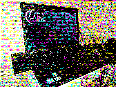
Do you rememeber the dithered picture of the Thinkpad X220?

This is my server. It's powered by Yunohost.
This Thinkpad X220 handle few projects on its back.
- This website
- A streaming server powered by OwnCast
- Search engine using LibreX
- Book library with Calibre-web
- And a TiddlyWiki for my little stories.
- a XMPP server that came with Yunohost base modules and more.
I try to use my server the way i used other services. But there's some stuff i'll not host on this laptop such as:
- Mastodon (or any of its forks) but i might try Go To Social
- Peertube
- Maybe some more
FAQ & Explanations
even if no one asked
Why all of this?
Started as a side project i wanted to have my own place on the web. It escalated real quickly.
I began to learn again HTML & CSS in the summer of 2021 with the discovery of Neocities a webpage provider, advocate for the creativity behind webpage creation.
My Neocities blog looked a lot like this one but more colorful. I still use it for fast HTML testing and implementing big stuff here.
Pictures
In the begining i wanted every picture to be clickable to see bigger versions but no-one need that (especially me). To unify the odd looking of the whole blog now every picture will be dithered for the sake of size and style.
Why? X220 Why?
I wanted to use it. Tried 2 other hardware to work with yunohost. The X220 was the best contestant among other machines. The first test was a Raspberry Pi 1B, the other one a old laptop i use with a projector. I do not hoard if it's not for using it one way or another. As far as i am in this project, it works quite well with the Thinkpad X220. Except when i troubleshoot stuff because it suddenly broke after an update But i'm happy with that setup.
The text editor fun
For the fun of memorising functions, i change back my text editor from a really talkative Visual Studio Code i used when i was on Neocities to Emacs. That i've learn to use on-and-off since 2012. It's a vanilla crazy punk flavor Emacs, homebrew with line numbers, highlight indent guides, super aggressive indent and word wrap enabled by default some expanded modes and a sick color theme.
I no longer use Kate or any other text editor.
Workflow
It's old school but best school. I've made 2 template; Simple and Double with CSS file for each. And that's it. A lot of trials and errors but that's how i learn and make it.
Thanks and Greeting
nothing there yet